
I hope everybody is enjoying the holidays. Here’s to another exciting stationery year! One of my New Year’s resolutions is to create an index page for all of the posts I’ve written up till now, as well as posting a bit more often. Stay tuned 😁
I hope everybody is enjoying the holidays. Here’s to another exciting stationery year! One of my New Year’s resolutions is to create an index page for all of the posts I’ve written up till now, as well as posting a bit more often. Stay tuned 😁
The most recent collection of short stories by Vladimir Nabokov, incorporating thirteen new stories, was published in 2008 to great fanfare. I’m just getting around to reading it now, because it usually takes me about ten years to catch up with major literary events; plus, I can’t exactly say I was a fan of this particular writer up till now. We’ll see.
Nabokov is widely known as having been a Blackwing enthusiast, and indeed his lifespan seems to have coincided with the glory days of the pencil in general. The humble instrument makes several appearances in his fiction, including the now almost-defunct indelible pencil. The following is from the short story “Bachmann,” about an egotistical musical genius of that name:
Bachmann was sitting on her bed, barefoot and in a nightshirt, with a plaid blanket humped over his shoulders. He was drumming with two fingers on the marble top of the night table, while using his other hand to make dots on a sheet of music paper with an indelible pencil.
After a memorable night, during which Bachmann’s mistress succumbs to a fatal illness, his agent inspects the aftermath:
On the night table Sack found a crumpled sheet of music paper, but no one was able to decipher the violet dots of music scattered over it.
I wonder how many modern readers will understand why the markings are “violet”? (And here I’m thankful for my crash course in pencil history over the past few years!) For my part I am curious whether Bachmann used a violet-colored indelible pencil, or used a moistened graphite one. I’d wager the latter – you’re not supposed to suck on indelible pencils because the aniline dye is poisonous, but I wouldn’t put it past any deranged artists.


(If you are unfamiliar with indelible/copying/ink pencils, you can start here, at Pencil Talk.)
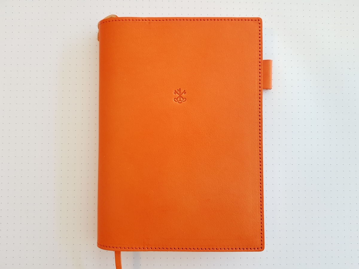
After considerable thought, I decided to get a new Hobonichi cover this year. I’ve been eyeing leather covers for some time, especially the ones produced by Arts & Science (Arts & Science is the boutique run by Sonya Park, who creates the English-language Planner); but up until last year the leather covers came with zippers and lots of sleeves – too fussy and bulky for my taste. This year the design was perfect.
Coincidentally, lots of other people fell in love with this year’s A&S covers, too. The navy and grey ones sold out in a matter of hours on September 1st, and I almost missed out on the orange Aragosta, which was gone the next day. They restocked them in October, but again the covers sold out in a couple of days. (It looks like the grey Argilla was the runaway hit.) They are now offering to restock all three colors next February.
When I unboxed the Aragosta, I found the almost fluorescent orange hue quite alarming – it was very different from the deep, mature orange in the photos. Also, the leather showed weird press marks, especially at the edges. Maybe this is the result of scoring or otherwise preparing the leather for cutting.
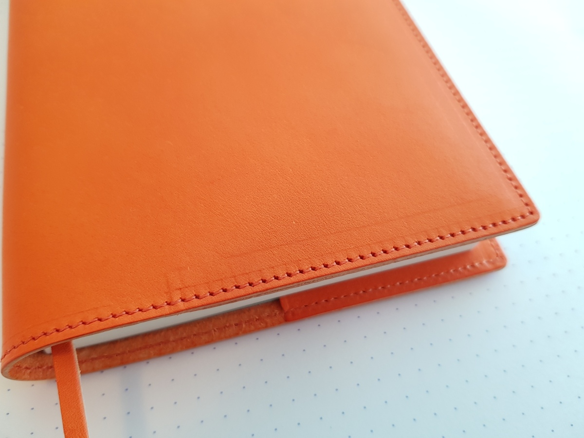

Fortunately, the marks seem to be fading, but it will take time. I got used to the color too. Overall, the cover is thick and encloses the Planner comfortably, allowing the front and back covers of the Planner to slide in and out of the sleeves smoothly when opening and closing. This is important, as the cardstock covers of the Planner are not very strong and will crease easily.
The reason I finally gave up on my Midori cover was the minute difference in size. In theory, Midori goatskin covers should fit the Hobonichi Planner, since they both conform to the A6 (bunkobon) format. However, the Hobo is slightly thicker than the Midori; and the Midori cover is intended to fit the slimmer Midori MD notebook perfectly. Which means that if you try to use the Midori cover for a Hobo, the fit will be really, really tight, and will make the spine of the Planner curve.

One unexpected thing about the Aragosta was that the bookmark seemed to be quite bulky. This is probably because the bookmark is cut from the same leather as the cover, which is nice, but probably a mismatch for the extra-thin Tomoe River Paper that the Planner uses.
Leather should age, but at this point I have no idea how this orange cover will change over time. The Midori goatskin cover tanned considerably over the past several years – the contrast between the original pale beige and the current caramel hue is quite striking.


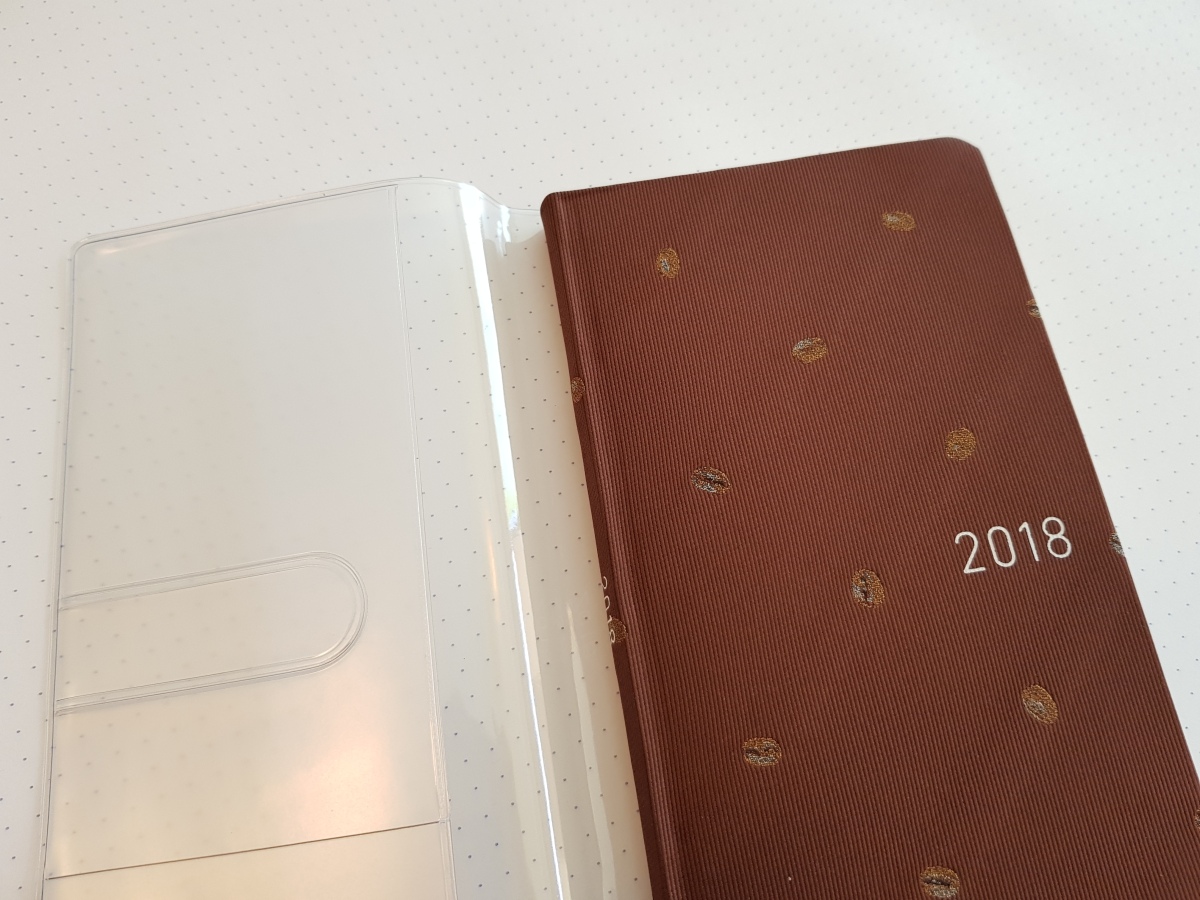
Finally, this is my Weeks for next year: “Coffee Beans” (also sold out at this moment). I got a clear cover for it this year because I found out (the hard way) that when they suffer water damage, the covers tend to curl. I’m looking forward to using this next year – maybe I’ll be tempted to fix myself a latte every time I reach for it :D
The other day I came across an interesting list, “50 Ways to Fill a Notebook.” The title strikes a chord with all of us stationery hoarders, surely. I read it with interest, and noted two things: 1. It included some things I would never ever use a notebook for, like gratitude journals (which is why it was interesting!), and 2. It did not include two ways I most often use a notebook for: recording books read, and looking up words in a foreign language. The latter (vocabulary lists) is, for me, by far the quickest way to use up my notebook stock, and I’ve written about it a little here, so, as a way of adding to this list, I’ll talk a little about booklogs this time.
Keeping a booklog is simple. You record the title, author, and date you finished it, one entry for each page. I usually number the book as the nth I’ve read that year; I also try to jot down some impressions (nothing approaching a book report, just a few sentences) if I feel like it. (Sometimes I leave it blank.) The book-per-page scheme means that it can take two to three years to finish a regular Hobonichi-sized notebook, so I’m stuck with one for a long time.
I started keeping a booklog in 2012, and for some strange reason the notebooks I chose for this purpose have all turned out to be duds.

The first notebook I used was the orange Quo Vadis Habana. It features silky-smooth Clairefontaine paper and a nice faux-leather cover. Unfortunately, I didn’t enjoy writing in it. First of all, the lines were ruled too tightly (5.5 mm!). Secondly, the paper is too smooth for my taste, almost slippery, and some fountain pens don’t take to it very well and will skip. (This happened most often with Pilot pens. And yes, I should have used pencils.) All in all I wished I could finish the notebook quickly, but it took me three solid years.

The second notebook (which is the one I’m using now) is from Bindewerk. This is also an extremely well-made, sturdy notebook, featuring good-quality paper packaged in an appealing design that strives to be different from the tired old Moleskine-ish rubber-banded format. Bindewerk notebooks look wonderful displayed on store shelves and I would not hesitate to recommend one to you. However, while it was much less frustrating than the Habana, it wasn’t a perfect match for my fountain pens either. It uses the kind of paper that’s “good” in the Western sense – thicker with a bit of tooth, with a solid cottony texture. It feels a bit like writing on sketchbook paper, which doesn’t provide that bit of surface “glide” for my pens. But this is purely a matter of personal taste. I am maybe a year away from finishing this one now and am already mulling over new candidates.

You don’t see the point of keeping a booklog? I used to think so too, but let me assure you, it comes in useful. First, you do forget what you’ve read. I recall reading on an online forum the memorable remarks of an inveterate reader: “…and as I closed the back cover of the book I remembered I had read the book before.” This happens. Especially when you’re reading an author who is prolific and whose novels tend to, well, resemble one another, like P. G. Wodehouse or Alexander McCall Smith, it can be difficult to figure out which book you’ve read and which you haven’t. In which case it’s useful to have your notes to jog your memory.
Also, I didn’t expect this kind of benefit when I first started, but going over the titles read in a given year provides one with a kind of perspective. There are bumper years in which you come across a slew of the meatiest, juiciest, most memorable books ever, and then there are years in which you don’t manage to read quite that much because either the literary scene was just not that interesting, or you moved house, or (more insidiously) your family started a Netflix subscription. In any case, because I haven’t been able to keep the books I read with me for some years now (library books were returned, and here I’m more and more reliant on my Kindle), going over my records is a delight in itself: just coming across a title while flipping the pages reminds me of the giddy moments I fell in love with that particular work. The books reside there in the pages of the notebook, side by side, sparkling, occupying a certain beloved moment in my past, even when they are no longer physically on my shelves.
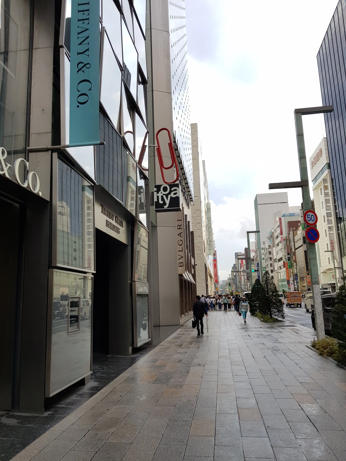
There are tons of stationery shops in Japan, but people seem to agree on one thing: Ito-ya is still the place to go to. It is a place of pilgrimage for stationery nerds. How does it manage to stay on top? Real estate seems to be part of the answer: the sight of the red clip wedged in between jewelers and fashion labels on one of the most expensive streets in the world seems to signal that stationery is to be taken seriously and that Ito-ya is its ambassador. I don’t know if Ito-ya actually outsells everybody else in the business, but it is definitely influential, and an industry leader. In this sense it was interesting to see how it changed. The store underwent a thorough renovation several years ago, and emerged after it a quite different kind of store.
Ito-ya used to be one of those stationers that tried to carry everything. Its Ginza store was no exception, and every square foot was overtaken by display shelves and carts, heaving with merchandise. But with the advent of online competitors, its goal now is to be “a shop where you can experience new things,” as opposed to a store that just sells stuff. (Here is a brief message from the CEO of Ito-ya outlining its future direction.) Especially with its main shop space, the G.Itoya building, efforts were made to incorporate restaurants (they grow their own vegetables), juice bars, postboxes and other quirky services.
Reading about all this, I was worried that I would find a great blank museum-like space upon arrival. For what is a stationer if not a purveyor of goods? Fortunately, it turned out that they had enough to make me happy. The crucial difference is that Ito-ya now curates its selection more rigorously, with an emphasis on things you can’t get easily elsewhere (they had Crane’s cards!). Also, they now put more effort into marketing their own proprietary brands: one floor is dedicated to these labels, most of which are not even stationery but travel items.
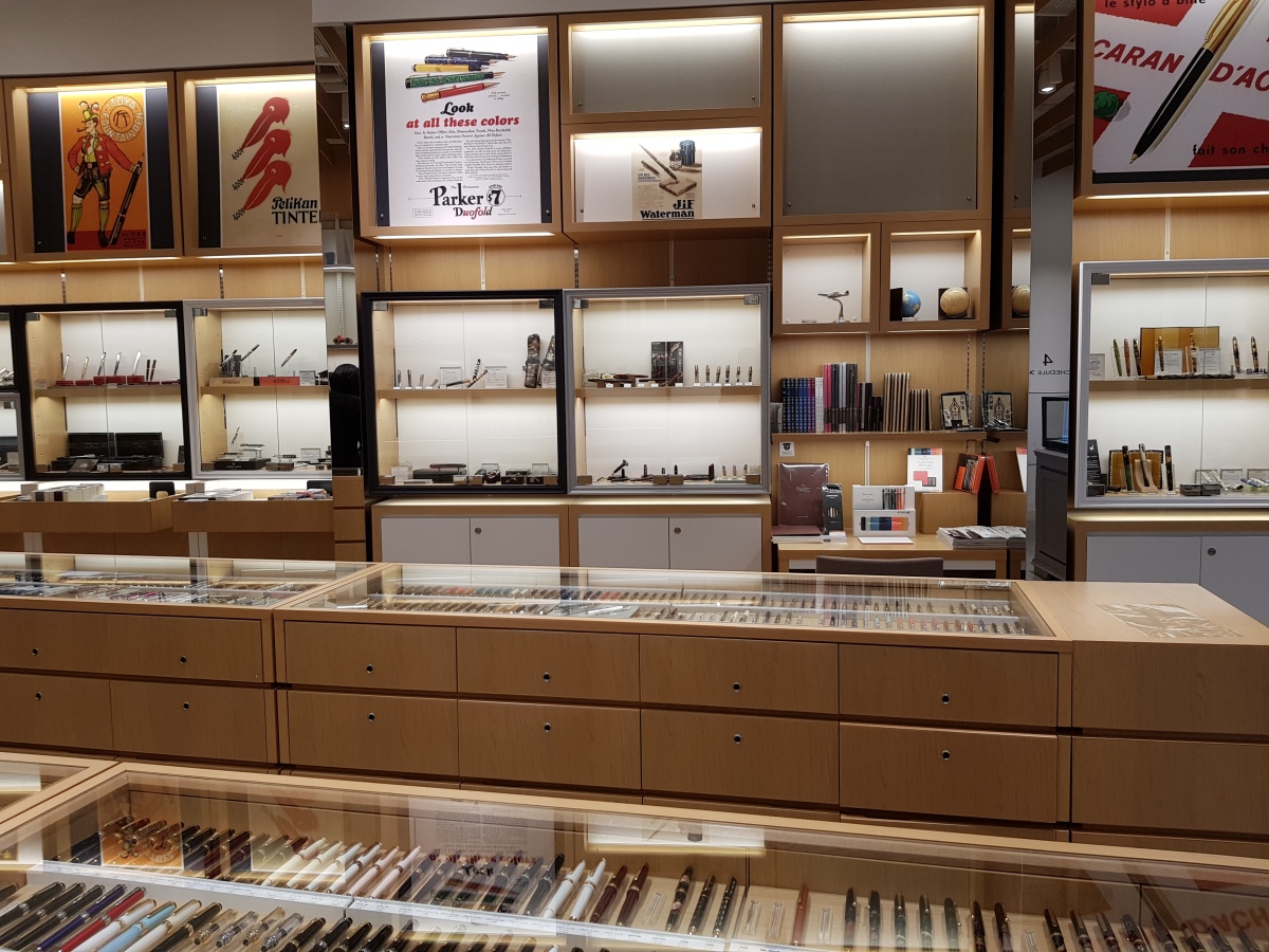
Here is a partial shot of the fountain pen floor: they came up with an elegant solution to showcase the multitude of pens while preserving the gallery-like feel. The Caran d’Ache 849 fountain pen went on sale at Ito-ya (ahead of all the other shops) the day after I visited, so I missed the chance to try it out.
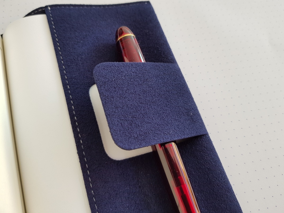
I wasn’t sure about their emphasis on their proprietary brands (I have yet to own an Ito-ya pencil, Romeo, Helvetica or otherwise), but after trying the book cover in their Color Chart line, I am completely won over. It is made out of an intriguing micro-fibrous material that mimics the feel of leather, and fits any pocket book snugly. I’d like to get more in this line in as many colors as possible next time!

I’m not sure whether you can tell from the pictures, but this material has a crease-resistant spring to it that is just mesmerizing. Stationery is a very high-tech affair in Japan.
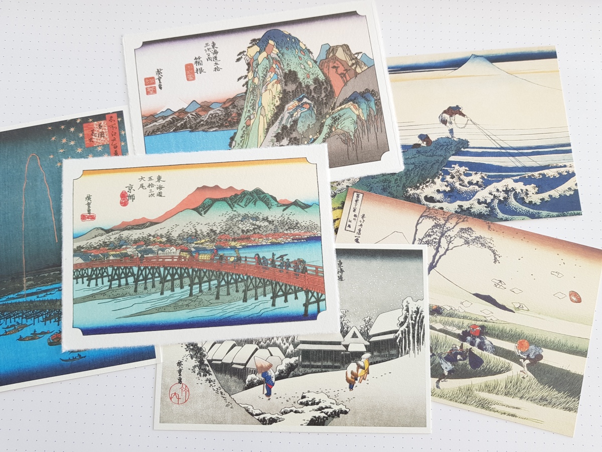
The first floor of the main building has always attracted its share of tourists, and Japan-themed postcards have always been available. Ito-ya still stocks them.
Now over to the annex, K.Itoya. This is where Ito-ya’s newfound art-gallery aesthetic bows to the demands of the office- and art-supplies department, and allows merchandise to be stocked like at a good old-fashioned stationer’s. Interestingly, premium pencils from Faber-Castell, Caran d’Ache and others were displayed here along with paints and colored pencils, and not with fountain pens in the main building. I almost missed them!
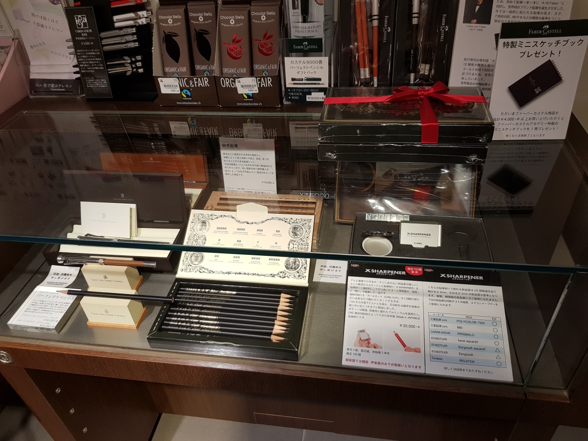
In the above photo you can see the recently released Lothar von Faber Polygrades. Next to it is something called the X-Sharpener that Kitaboshi and CARL collaborated on for a TV program, which called for “an unbreakable colored pencil.” Following a series of tests involving dropping a half dozen red colored pencils from a certain height, CARL came up with this sharpener that produces a shape like a steeply inclined china pencil with a step, with only the wood peeled away and leaving the core untouched. They produced 100 of these sharpeners, at ¥20,000 each. I asked whether Ito-ya had sold any, and the salesperson replied that they got five for the store and sold three so far.
But the most amazing item was this:

The Bosco Wood Pencils, made by the same people who brought out the Colleen Woods pencils twenty years ago, is a limited edition set of 200 (or 300, depending on the source) featuring beautiful woods sourced from around the globe. It retails for ¥10,000. And Ito-ya had a sharpened sample. (Note that the Polygrades above were also sharpened.) I asked how they ever thought to do such a thing, and the salesperson said, “Oh, we had to make sure everything was OK.” I had never been interested in this particular set (as a rule I dislike expensive, ornamental pencils), but when I saw how smoothly and softly they wrote, I had to get them. The wood is fragrant, and the hexagonal edges razor sharp; altogether the tactile experience is sublime.
Back in Korea, I got together with some stationery friends for a small experiment. I wanted to try hand-sharpening these pencils, and I also wanted to know what others thought of these woods, as I knew next to nothing about them. Also, the sharpened pencils by themselves would make a marvellous souvenir. So we settled down with a pencil each, and reached some surprising conclusions.
First, the woods are all without exception extremely stiff and hard to sharpen. Sharpening by hand was positively dangerous, and I was afraid I would damage the handheld and crank sharpeners I used. Pencil #3 is a case in point: a friend started hand-sharpening it but quickly gave up, I tried with a borrowed Gekkoso 2-hole sharpener but the lead broke three times, so in the end I had to finish it off by whittling down the wood very carefully, exposing a minimal amount of lead. The imbalance between the hard wood and medium-to-soft core seems especially amplified in pencil #3, and no doubt something like this happened to the Ito-ya sample set too, as that particular pencil is shortest. I still love the artisanal details of this Bosco set, but all this led me to appreciate all over again other pencils such as the Caran d’Ache “Crayons de la Maison” series. They are expensive “premium” pencils too, but are easy to sharpen, with a good, balanced lead: in other words, they are pencils made by pencilmakers, true to the basics. The Bosco pencils are emphatically the work of a furniture-maker.

(I hand-sharpened two in this set, in addition to the aforementioned pencil #3. Can you guess which? By the way, pencil #5 was sharpened with a brass KUM 2-hole sharpener, and pencil #8 with a Deli 0668. I hope to try a CARL Angel-5 Royal on one of the remaining two.)
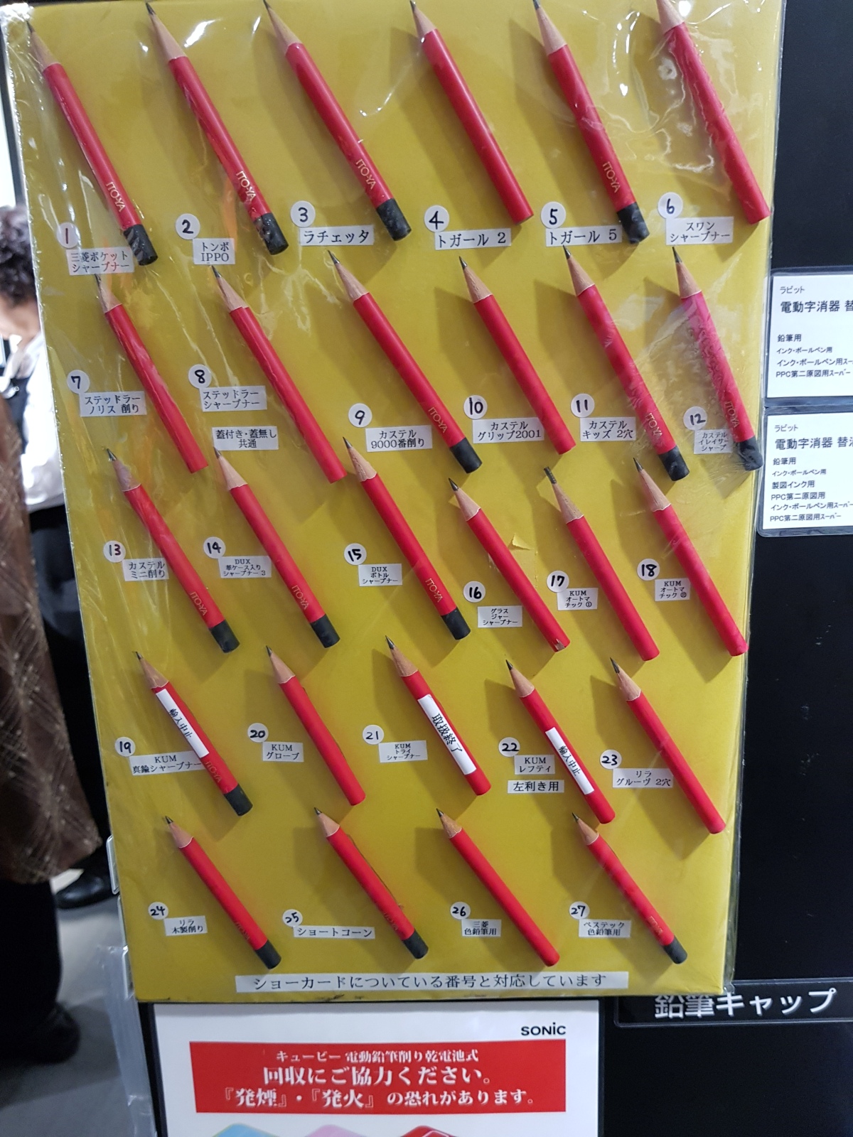
Speaking of sharpening, there was also a very informative display showing the sharpened shapes for each sharpener they carried.
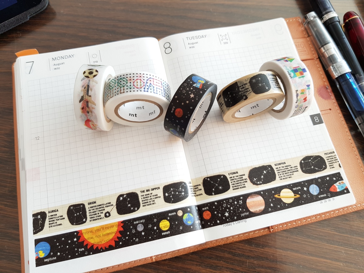
Some other tidbits I picked up there: all the masking tapes I bought this time are from the MT for kids line 😅
And last but not least, a talisman for a well-rounded stationery life.
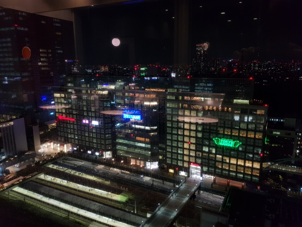
Tokyu Hands in Shinjuku is a fun place. Occupying seven floors off a corner of Takashimaya Times Square, it sells chic home supplies and lifestyle products, hard-to-find curiosities and sometimes just plain weird stuff. Because the store’s selection overall is so idiosyncratic, I had trouble thinking of it as a serious stationer up till now, since I’ve bought furniture and drapes there as well as pens and notebooks in the past. But to my surprise, it was one of five major stationery stores featured in the Staedtler podcast (of course, this list is far from objective, as it probably reflects Staedtler Japan’s preferences circa 2014-2015 and especially its aim at that time of promoting its new Premium line of fountain pens, but I do think that the list has a point). This particular branch is located in one of Tokyo’s prime commercial districts, with a trendy clientele that is neither too young nor too old, and is therefore an outstanding example of the well-rounded and well-stocked general stationer. (Ito-ya, incidentally, has moved away from this department-store-style stock-everything model.) It also issues Hands-only limited editions in partnership with stationery brands from time to time; actually, this kind of thing seems obligatory for any stationer worth its salt, in this town.
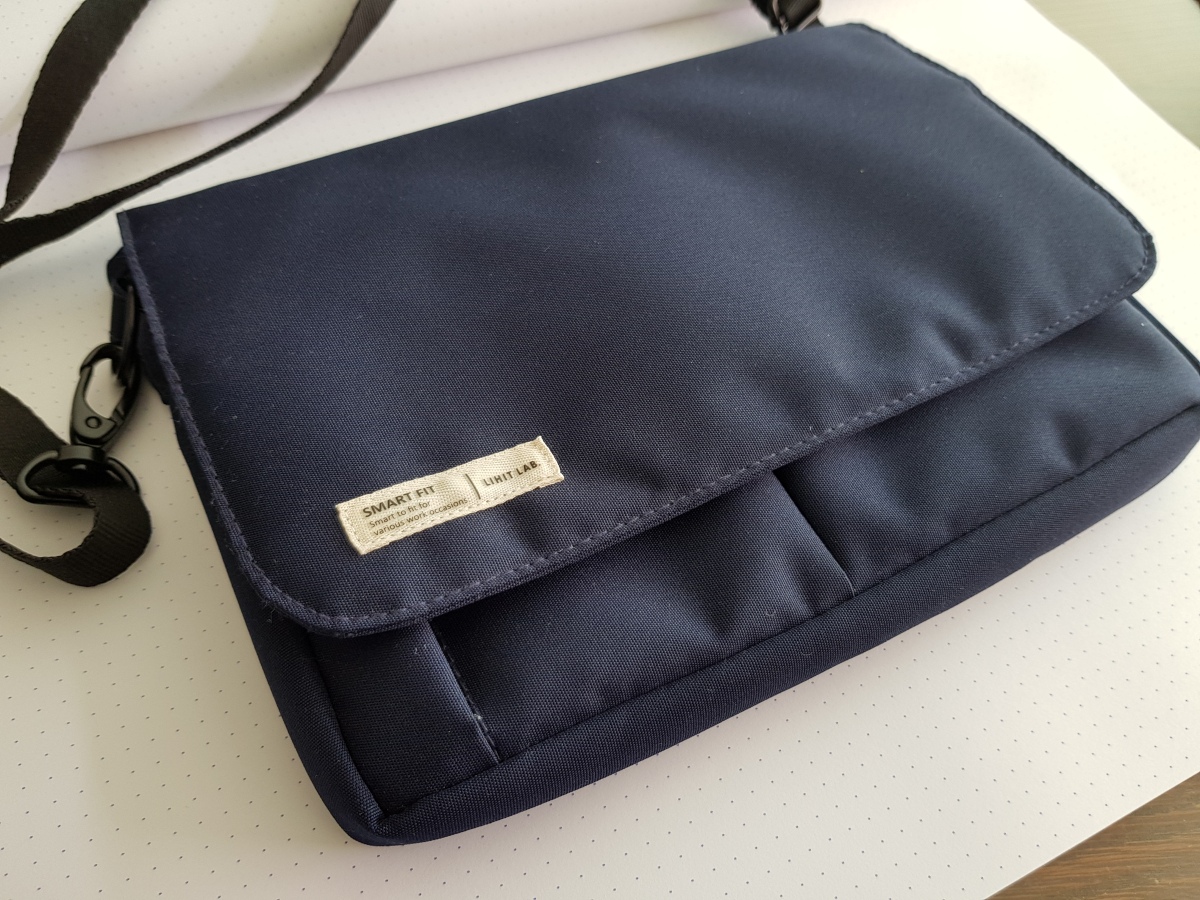
I got my first Lihit Lab product there: a bag from the “Smart Fit” line that can fit in a couple of notebooks and some pens, plus maybe a diary or small notepad. The material is Cordura, and this really makes a difference – it looks and feels so much nicer. The strap is sold separately.
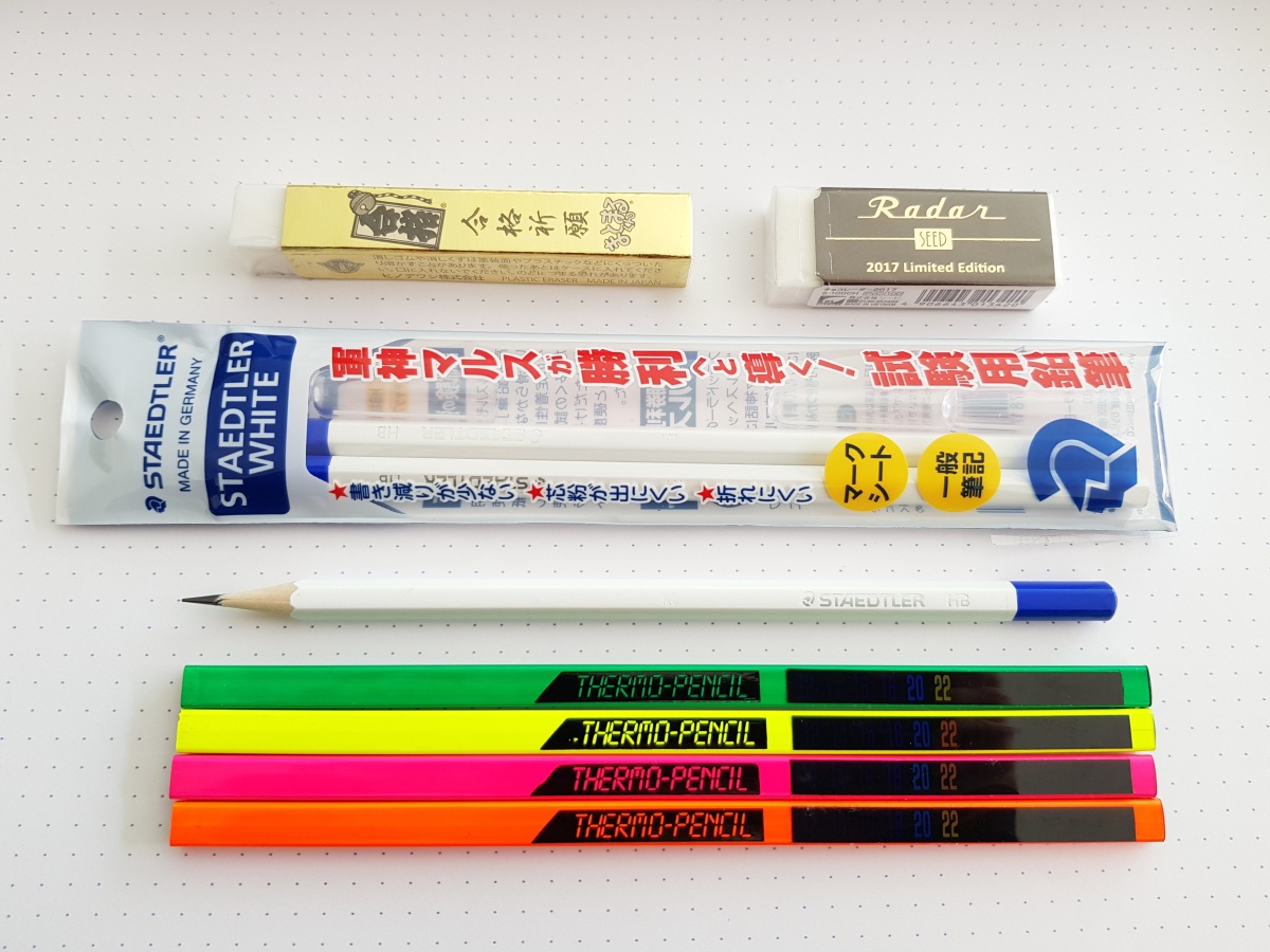
Some special pencils and erasers from Hands: the Japan-only Staedtler White HB (a kind of mark sheet pencil – “Mars, the god of war, will lead you to victory!”), a special-edition Hinodewashi Matomaru-kun eraser that will help you pass your exams, and a Seed Radar 2017 limited edition. It’s my first proper Seed eraser (though I probably used it already, in other OEM-ed incarnations). The Thermo-pencils were chosen by my son.

The denim book cover on the left is another trophy from Hands. The one on the right is from Ito-ya and will be discussed in the next post.

And last but not least, some seasonal postcards from Kyukyodo. I love the way Japanese stationers still stock letter-writing paper and postcards; a lot of it is seasonal, and the designs and colors are a joy to behold.
I’m going to wrap up my Tokyo report with a final post on Ito-ya sometime soon. I didn’t realize it had been almost a month since I last posted! Hopefully the next one isn’t going to take as long.
I have a couple more things left to say about my trip to Japan, but I’d like to sneak in just one post about Crane’s, while the topic is still fresh. Crane and Co. is a venerable paper company (founded 1801) based in Dalton, Massachusetts. I lived in the Boston area as a student many years ago, and developed a fondness for this “local” brand of paper that was sold in the university co-op. (If I were ever to draw up a “bucket list,” it would include ordering a lifetime’s worth of personalized stationery from Crane’s.) However, Crane’s is very hard to get outside the United States, and expensive too; so the brand mostly remained a fond memory. When I visited Boston again in 2014, I found that many of the familiar stores, including stationers, had closed or changed; the co-op had also gone through a number of transformations, and no longer carried any stationery to speak of. I feared for firms like my beloved Crane’s in the digital age: unneeded and unused, well-made but not appreciated.
However, in this week’s issue of the New Yorker (the first-ever Television Issue), I came across a surprising fact: Crane and Co.’s business is actually much more than stationery. It supplies the paper for American currency, in fact, has been doing so for almost a hundred and forty years! I will never look at a hundred-dollar bill in the same way again! In fact, their expertise is such that they even make bills for dozens of other countries as well. I am so relieved. Crane’s (now renamed Crane Currency) will not be going anywhere in the forseeable future, and it will presumably remain healthy enough to carry on making superlative stationery on the side. Time to celebrate by highlighting some choice items from my hoard 😉
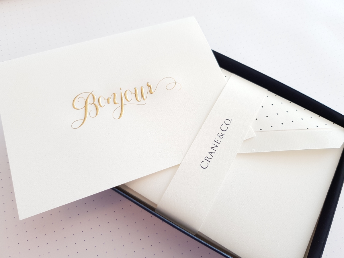
First, some greeting cards, that Crane’s does so well.

And Christmas cards and New Year’s cards:

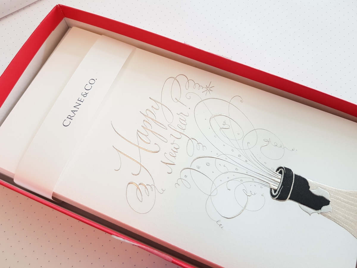
As you may have guessed, I tend to fall for the calligraphic accents. There are many companies that make greeting cards, but the level of detail you see on a Crane’s card is on an entirely different level. But this quality comes at a steep price. I often think buying greeting cards and letter paper is the ultimate form of altruism – you buy them in order to give them away. I haven’t managed to part with all of them, not yet.
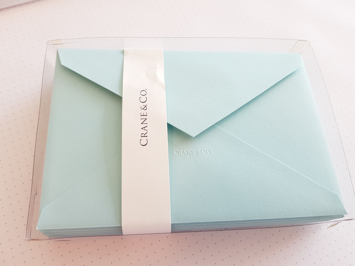
Crane’s does the Florentine floral too, but in my opinion it’s not one of their strong suits. But look at the lovely watermark on the envelopes.
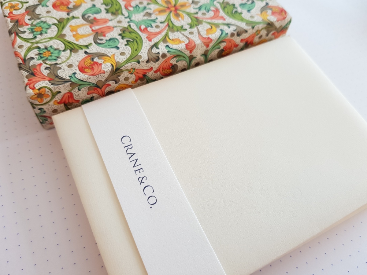
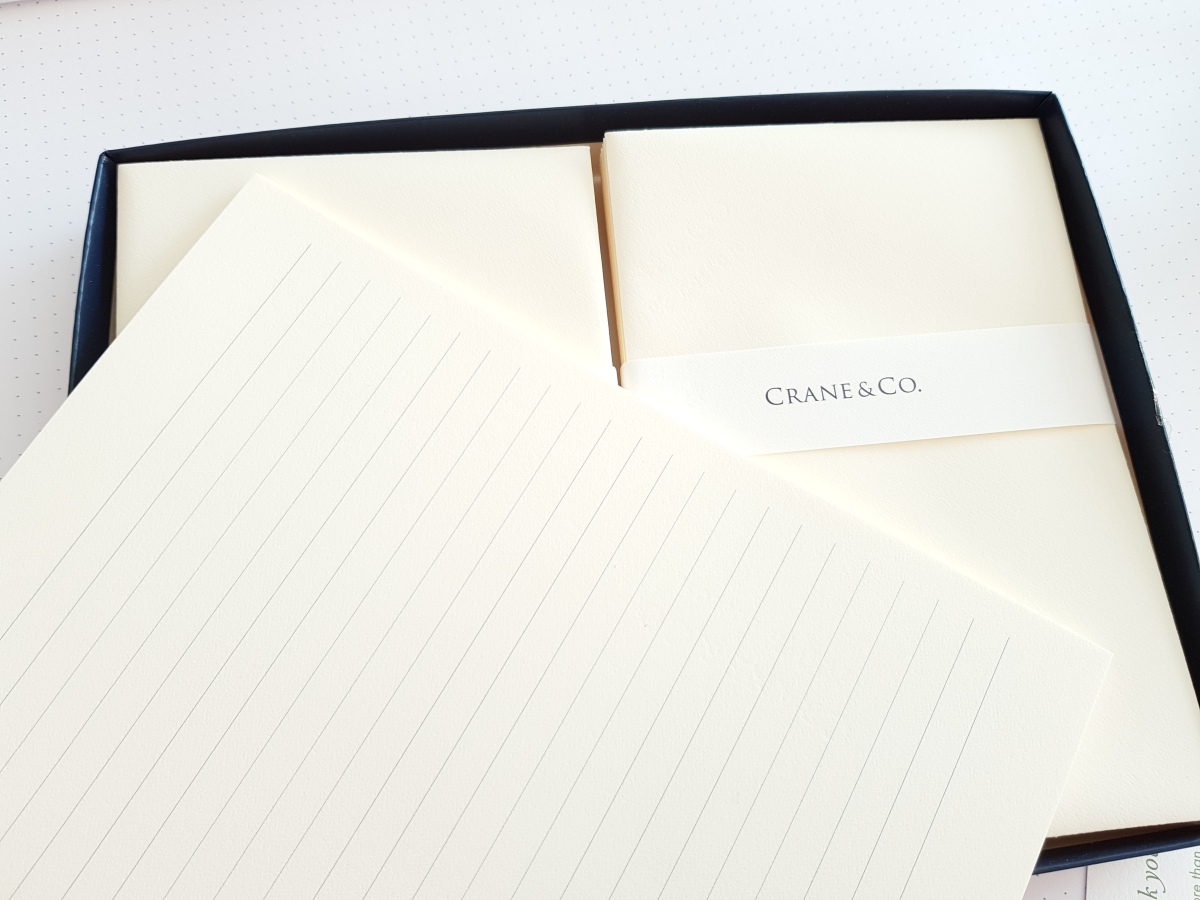
Here is a set of letter paper, with envelopes (one sheet per envelope). I used one pair so far and was in pen heaven all the while. Crane’s paper has a very distinct feel: while other kinds of “high-end” letter paper tend to emphasize the laid pattern and/or thickness, Crane’s remains thin and smooth, but with a tensile strength that hints at an extremely compact mass of fine fiber. It’s different from the smoothness you get from Japanese paper.
And now we approach quasi-vintage territory (20+ years). I’m partial to these Hobonichi Planner-sized envelopes, and in this too Crane’s was my first love. Ever since I moved out of the U.S., I’ve had to make do with G. Lalo.
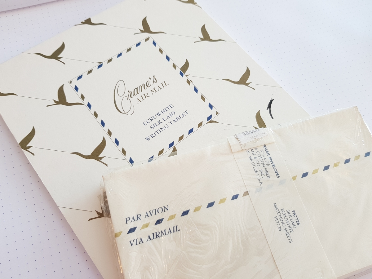
Lastly, some airmail stationery. I didn’t know it at the time, but these were probably drawing their last breaths even as I bought them. You can’t get them anymore, can you? Or those blue aerogrammes that you could write and then fold into an envelope? The sheets have yellowed somewhat but otherwise remain in pristine condition 😀
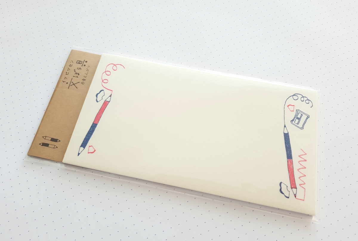
Here are some new additions to my stash of Ippitsu-sen. (See my previous post for an introduction to this particular kind of Japanese correspondence paper.)


There was one more pattern to complete the quartet, which I didn’t buy. (Just so you know.) I got these at Maruzen, which, had I not listened to the Staedtler Japan Radio podcast from several years ago, I would surely have left out of my to-visit list. You see, even though I was reasonably familiar with Tokyo and its stationers, I had never felt the need to distinguish one well-stocked store from another (with the possible exception of Ito-ya). I lived along the Seibu line so I went to Loft a lot, and didn’t care if my pens and notebooks came from more general chains or department stores. But listening to the podcast, I realized that there was a hierarchy of sorts among the stationers, reflecting the history and breadth of each. The podcast featured five stores in the latter half of its season: Tokyu Hands (a DIY lifestyle store, Shinjuku branch), Mitsukoshi (a department store, Nihonbashi branch), Sekaido (an art supply store in Shinjuku), Ito-ya (stationer extraordinaire in Ginza), and Maruzen (Marunouchi main store).

Now, the thing about Maruzen is that it is first and foremost a bookstore, albeit with a respectable stationery section. I’d visited one of their branches once or twice in the past but saw nothing to mark it out as either a bookstore or stationer at that time. But the podcast informed me that this venerable institution was founded 150 years ago in Yokohama, and played a pioneering role in introducing Western culture to Japan: it was long known for its selection of Western books, and was the first to import fountain pens (Onoto, 1907). Literary figures of the time routinely mentioned visiting the store in their writings. The Marunouchi main store now occupies four stories in a glittering high-rise near Tokyo Station, in the heart of Tokyo’s old business district; they say 100,000 people pass by the building daily, of which 4,000 visit the stationery section on the fourth floor. So naturally the Maruzen store stocks more upscale goods designed to appeal to grownups (and businesspeople in particular). The stationery section was smaller than I expected, but it did feature some notable items. The fountain pen desk was extensive and tastefully done. I can’t resist adding a couple more pics:

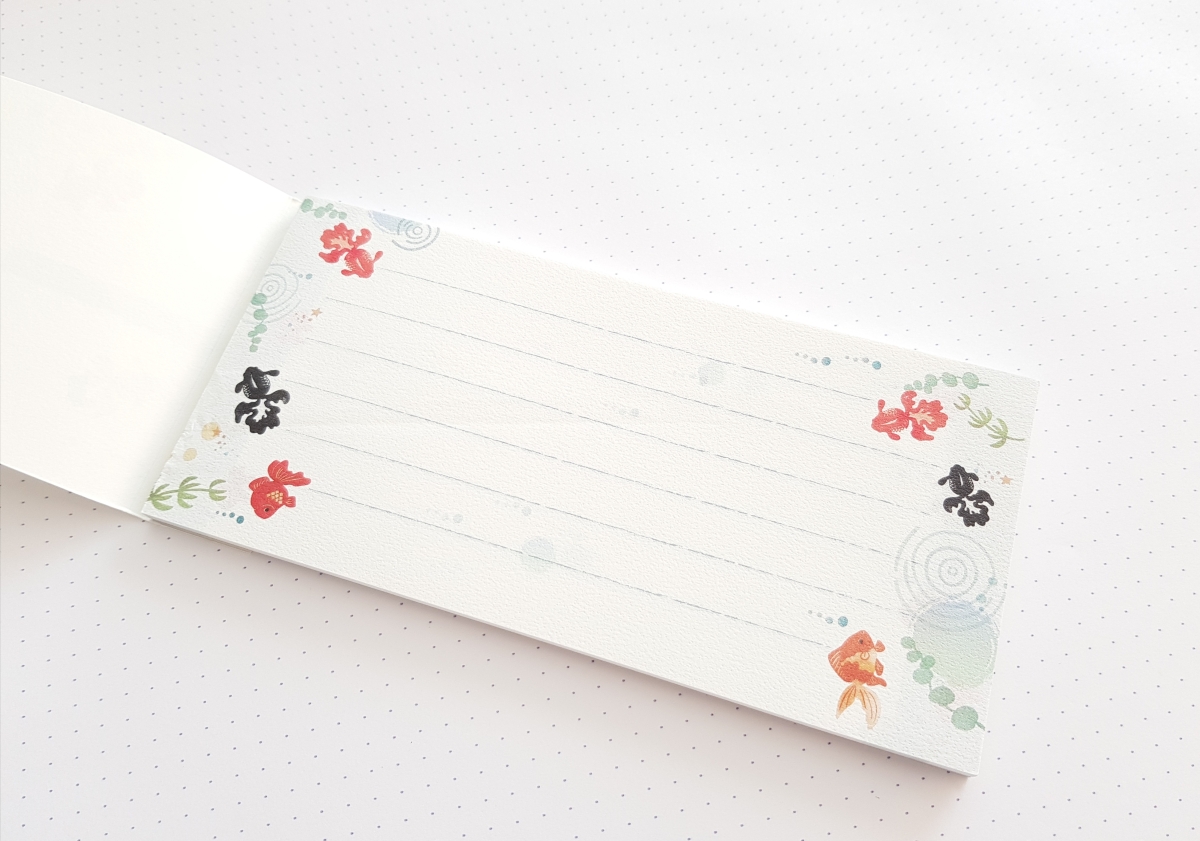
Coming back to the Ippitsu-sen: isn’t it wonderful that there are products that just assume stationery nerds like us exist, who love pens and pencils and even rulers, and would snap these up in a heartbeat? By the way here’s another, more traditionally summer-y theme featuring goldfish.
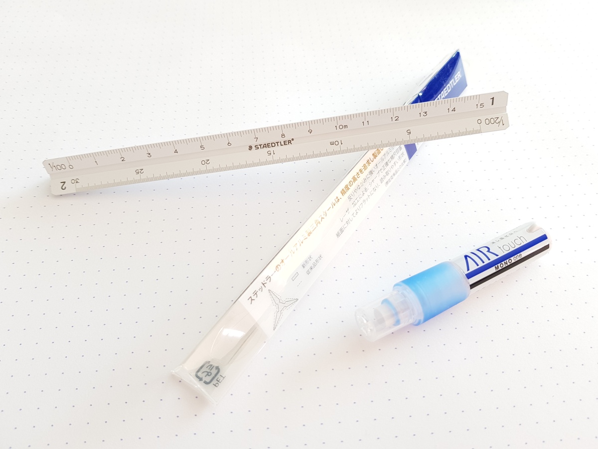
Last but not least, here are two other items I got from Maruzen: a triangular scale from Staedtler Japan, and a Tombow Mono One AirTouch. The scale was specifically mentioned in the podcast, so I was able to recognize it when I saw it. There were other variations, longer, shorter (10 cm!), for architects, for surveyors. It’s a very well-made, delightful object. I hadn’t planned on getting the AirTouch, even though the original Mono One was celebrating its tenth anniversary and there was a display with the Ones in all the colors of the rainbow in all of the stores I visited, but then Maruzen had an eraser testing station and I fell for it. Not bad at all!
For one reason or another, I have found myself in Japan at regular intervals throughout my life. The first couple of times it was because of my father’s job. Then I moved to Tokyo by myself to work. Later on, my husband was posted there, and we welcomed our son into the world in the port city of Yokohama. All this has led me to think of that country as a sort of second home, and my regularly timed returns have allowed me to experience it as a series of snapshots at different points in time. This summer we returned for a trip down memory lane after a hiatus of ten years. My, my, things do change, even in Japan.
I consider myself fortunate to have lived in a truly cosmopolitan city during my formative years. My memories of the city are tinged most vividly with the giddiness of new adulthood: first job, first business trip, catching the last train home, and so on. Tokyo was sophisticated and massively entertaining: on top of the local attractions, all the best that the world had to offer found its way into the city. In stationery as with everything else, it wasn’t necessary to become an “enthusiast,” tracking down brands and products; everything could be had easily in stores nearby. But it wasn’t only the material comforts that left a lasting impression. What I didn’t realize back then was that it was also a good place to learn how to live with grace and courtesy under extremely congested living conditions. Tokyoites still dress with care, queue religiously, refrain from talking on cell phones in commuter trains, and have an enviable knack for reading the flow of pedestrians on a crowded sidewalk. And they apologize all the time.
This time, however, we found ourselves in a substantially changed landscape. In particular, the area around Tokyo Station, Yurakucho and Marunouchi were unrecognizable. It seems as though Tokyo has been systematically replacing old buildings with new ones, most noticeably in the old downtown area; the shocking thing is that they build them so much taller now, earthquakes be damned. Another thing that was impossible to ignore was the sheer mass of Chinese people present in the city. Tokyo has always been home to a much bigger foreign population (including a sizeable Korean diaspora) than other Asian cities, but this was never enough to change the way things were done. This time it was different. Most of my fellow shoppers at Tokyu Hands and Itoya were Chinese. All of the servers at the diners and restaurants we went to during our stay (including the airport) were Chinese. The stampede was such that the shops had changed their ways in order to accommodate them: there was of course Chinese-speaking staff available, and it was much easier to get the sales tax refunded now at big stores, some of which were even equipped with passport readers to scan information directly into the machines. (Ito-ya still processes the refunds by hand at designated floors.) It is a welcome change, but I wonder what the long-term effect will be; at least I hope all this will help keep stationery manufacturers afloat.
Speaking of stationery: every family trip contains the seeds of conflict for the likes of us, because there is never enough time to visit all the shops you want, while you are also obliged to participate in more “normal” family activities like visiting the zoo. So I planned this trip carefully. First, I picked a hotel bang next to Tokyu Hands in Shinjuku. Shinjuku is a good place to stay in because it has many bookstores, stationers and department stores within walking distance that are open till 9pm or even later; the Narita Express stops here too so transportation to and from the airport is reduced to a minimum. (Time is money and never more so than during a short-term stay in Tokyo!) This way you can make use of any scrap time you have left for stationery shopping. So when my husband was winding down after a long day with a can of Yebisu and sumo on television, I would sprint across the train tracks to Tokyu Hands and stay there till they closed.
The second important thing is to cull your wishlist ruthlessly and prioritize. I only got to visit three stationery-related shops during our four-day stay: Tokyu Hands, Ito-ya and Maruzen. Of course there were scores more I wanted to visit. Sekaido. Loft. Bung Box. Kakimori. Kingdom Note. Shosaikan. And a couple of other shops I saw on Instagram. But it was not to be. But for those I did visit – and this is the third point – I managed to secure a whole afternoon for myself. So my advice is to calculate just how much off-time you will be allowed without becoming a total pariah, arrange something else for the rest of the family, and try to make the most of it :) I’ll be posting pictures of some things I got from this trip in the days to come.
Greetings, everyone! I have been away all July and have just come back to Montevideo. The summer was hot, humid, and inspiring; we visited family, we visited lots of hospitals and got all fixed up, and we made a long-overdue nostalgic trip to Tokyo. But before recounting my stationery adventures I must start with what I came across on the long long flight home.

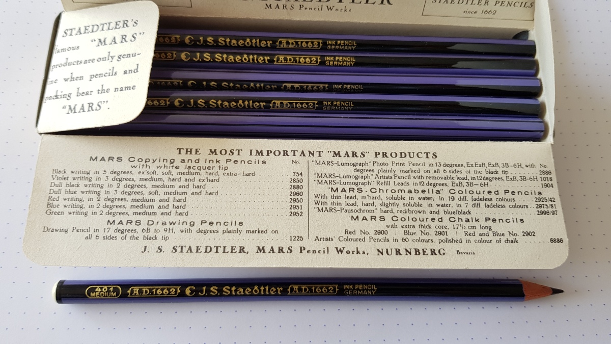
This incredible shot is from the Australian film Red Dog: True Blue (2016). A twelve-year-old boy is sent to live with his grandfather, near Pilbara (scorched red earth, bush and seemingly not much else), after his father dies and his mother is committed to an institution, where he befriends a very special dog. I know, it’s the usual heartwarming doggie story, and nothing about it suggested it would reach sublime heights moments later with a shot of a vintage Staedtler tin and a Möbius+Ruppert pencil sharpener.
This assortment of stationery is what Mick needs in order to do his “correspondence sets” via radio instead of attending a normal school. I think the movie is set in the late 60’s, judging from various clues such as women’s dress, one character’s involvement in Vietnam and the fact that the “Summer of Love” in San Francisco is supposed to have “just happened.” In that case we may conclude that the pencil case is a hand-me-down from his grandpa, since that particular Mars head was used until the 50’s; the sharpener is more of a stretch because Gunther (@Lexikaliker) informs me that this particular model, the 602, was introduced around 1970.
But never mind the dates – it’s simply a beautiful shot. Kudos to the good work from Down Under!
Just another WordPress.com site
For the love of pens, paper, office supplies and a beautiful place to work
Dipping, Writing, Experimenting
Our bricks & mortar shop is at 250 Carlaw Ave, Unit 105 in Toronto, Canada - shop online at wonderpens.ca
thoughts on pencils and stationery
thoughts on pencils and stationery
My Collection - Photos and Commentary
A Small Idiot Writes
thoughts on pencils and stationery
thoughts on pencils and stationery
thoughts on pencils and stationery
thoughts on pencils and stationery
For Fans of the Genuine Blackwing 602
thoughts on pencils and stationery
punctus contra punctum
Any old pencil won't do
thoughts on pencils and stationery
